Where Should You Place Your Company Logo on a Corporate Uniform?
Your company logo is one of the most important branding elements on a corporate uniform, but its position can significantly affect the overall appearance. The right company logo placement on a corporate uniform should provide good visibility without making the garment look overcrowded or unprofessional.
From the classic left chest to sleeves and back printing, each position serves a different purpose. This guide explains the most common logo placements and how to choose the right option for your corporate uniforms.
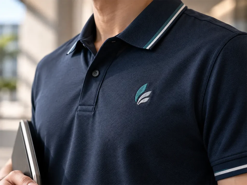
1. Left Chest — The Most Popular Choice
The left chest is one of the most common positions for company logos. It provides good visibility while keeping the uniform clean and professional, making it suitable for polo shirts, corporate shirts, jackets, and workwear.
- Professional appearance
- Easy to recognise
- Suitable for small to medium logos
- Works well with embroidery
- Suitable for most industries
For businesses that want a simple corporate appearance, the left chest is usually the safest choice.
2. Right Chest — Ideal for Names or Secondary Branding
The right chest can be used for a company logo, but it is often reserved for employee names, job titles, department names, or secondary branding.
A common layout is to place the company logo on the left chest and the employee’s name on the right. This creates a balanced design without making the uniform feel crowded.
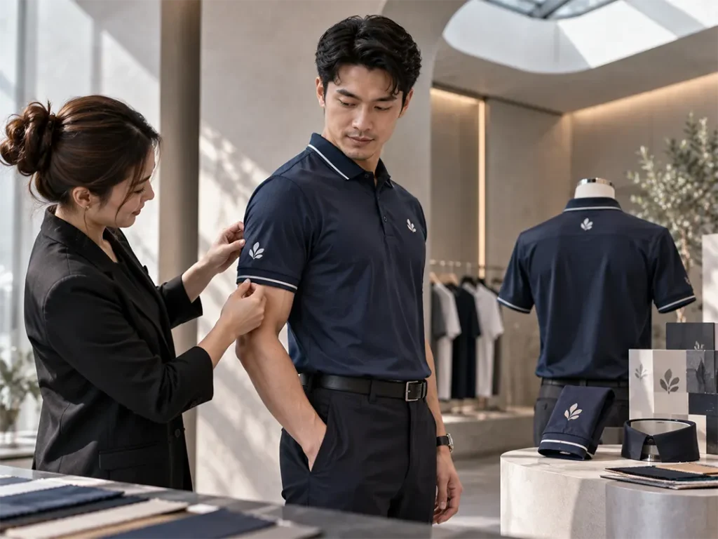
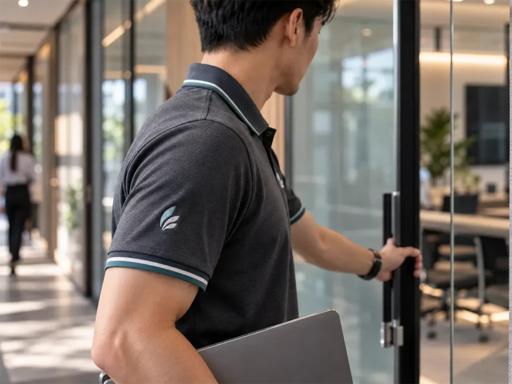
3. Sleeve — Subtle Additional Branding
Sleeve placement works well when you want to add secondary branding without competing with the main company logo.
- Secondary logo
- Brand icon
- Department name
- Partner branding
- Small promotional message
Sleeve logos should generally remain small and simple so the main branding on the front remains the visual focus.
4. Back — Best for Maximum Visibility
The back provides significantly more space than the chest or sleeve, making it suitable for businesses that need employees to be easily identified from a distance.
Back printing is commonly used for event teams, technicians, delivery staff, construction teams, and promotional uniforms.
- Large company logo
- Company name
- Website
- Short tagline
Keep the design simple. Adding too much information can make the uniform difficult to read and less professional.
Which Logo Placement Is Best?
For most corporate uniforms, a left chest logo is enough. Additional sleeve or back branding should only be added when it serves a clear purpose.
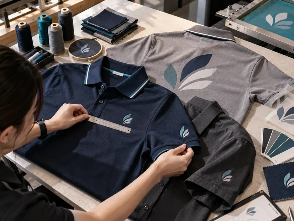
Embroidery or Printing for Your Logo?
Logo placement also affects which branding method works best. Embroidery is ideal for smaller chest and sleeve logos because it creates a premium, durable finish. Screen printing or DTF printing is generally more suitable for larger back designs.
Frequently Asked Questions (FAQ)
What is the standard position for a company logo on a uniform?
The left chest is the most common position because it offers good visibility while maintaining a professional appearance.
How big should a corporate uniform logo be?
Logo size depends on the garment and design. It should be large enough to remain recognisable without dominating the uniform. Your supplier can recommend dimensions after reviewing the artwork and garment.
Can I put logos on both the front and back?
Yes. Many businesses use a small front logo for professional branding and a larger back logo when greater visibility is required.
Conclusion
The best company logo placement on a corporate uniform depends on how the uniform will be used. The left chest remains the most versatile option for professional branding, while sleeves provide subtle additional branding and the back offers maximum visibility.
Keep the overall design balanced and avoid adding logos simply to fill empty space. The right combination of placement, size, and branding method can make your corporate uniforms look cleaner, more professional, and more recognisable.